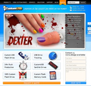
My Client
CustomUSB is and has been a wonderful client to work for. I am tremendously grateful to have been serving their web and general creative needs for several years. They have always been pioneers in their market and are industry leaders who set the bar for competitors; this is evidenced in the myriad copycat operations closely following CustomUSB’s example — and in many cases even blatantly stealing our graphics, designs, and communications wholesale.
The New Site
There were two main objectives for the 2011 overhaul: 1) A completely new design that would freshen the brand and show off all the cool gadgets the company produces, and 2) provide my client with an intuitive user-friendly interface to facilitate the adding/editing or products and all other manner of content updates.
The former was relatively easy — making things look good is, you know, a big part of what I do (which is not to say that it wasn’t a ton of hard work). The latter was however more challenging and its importance to my client (and so many business operators) cannot be overstated. So I immediately brought on a superior subcontractor to be the CMS/backend engineer, and together we exceeded expectations when the final product was delivered.
A Key Benefit
One of the results is that my client needs me less, significantly so. And I couldn’t be happier about that. I have absolutely no interest in nickel-and-dime-ing clients on minor updates and edits. But I also can’t do work for free, regardless if it’s a one-off or steady work (I wouldn’t have lasted a year as a freelancer doing that).
I’m sure it’s frustrating to lack the experience or tools to update one’s own site. That’s why, whenever possible (and it generally is these days), a top-priority in any site design is to give my client maximum control when done.
It is no selfless act, mind you. What I’ve discovered is that this approach is truly in the best interest of designer and client — because happy clients keep coming back, and when they do, it’s often something for me to sink my teeth into, not a laundry-list of typos and broken links to tidy up.
The Old Site, in Case Anyone was Wondering…
A few years prior to launching the new site, I re-built customusb.com for the first time. In that go-round, I did implement a new design, but it was not a big departure from the existing site, which was pretty sharp. The bulk of the work on that project was in rewriting the guts of the site to achieve a proper separation of content and design.
In the process I streamlined and optimized the site, and one result was shrinking it’s footprint by more than 50%. This had an immediate, dramatic and sustained effect on user-behavior; doubling the key analytics metric.
There is, or at least was for a few years, prior to the ubiquity of mobile, a hubristic confidence in high-speed broadband (and access to it) among some designers/developers, and our results bolstered my belief that Speed Is King on the internet — always has been, always will be.
