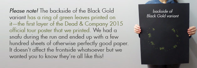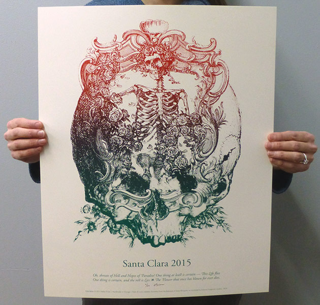
For the Santa Clara main edition, we went with a red-to-green split fountain. We’re calling it the “Mexicali” color scheme and it turned out great!
We did a pair of variants for the Golden State—one on natural white and one on black, both with sparkly gold ink.
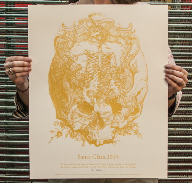
You can’t tell from a head-on photo, but the White Gold edition is especially sparkly.
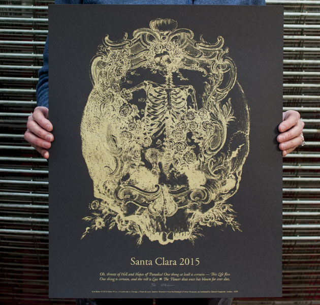
The Black Gold edition is pretty shiny too, we double-hit the whole edition (printed the same layer twice) since the dark paper absorbs some of the first pass and can dull the color.
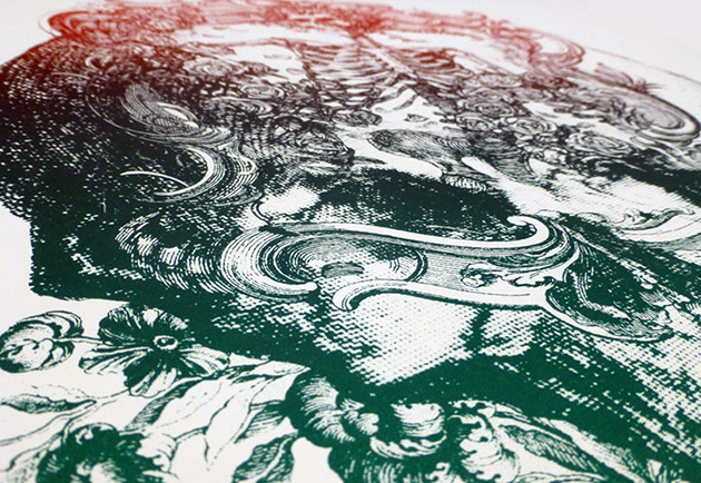
Detail shot of the main “Mexicali” edition.
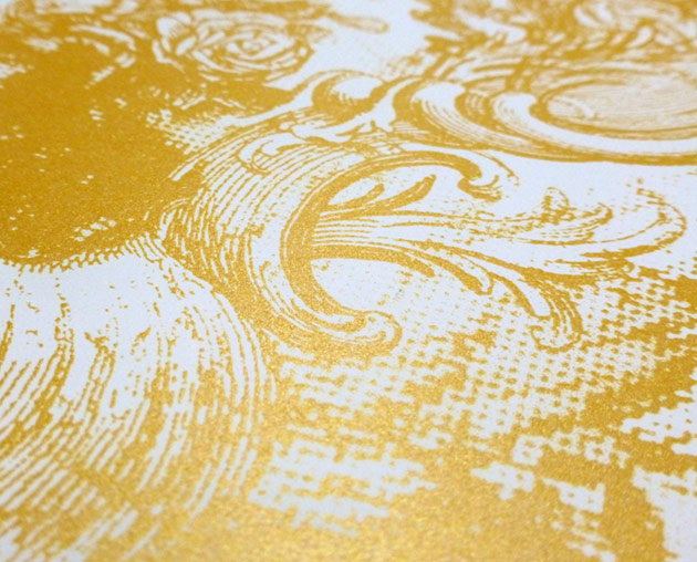
Detail shot of the White Gold edition.
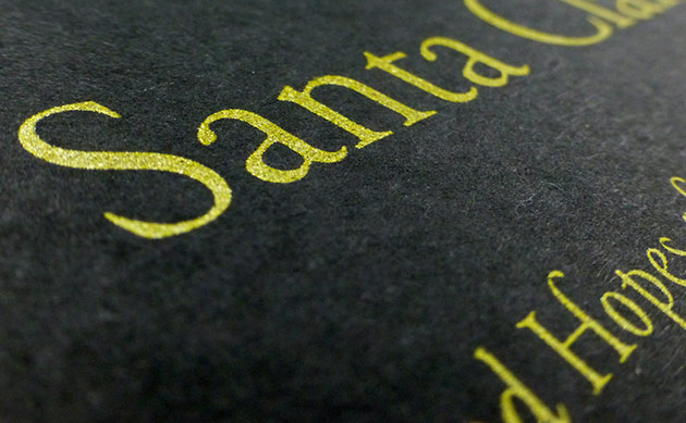
Detail shot of the Black Gold edition.
