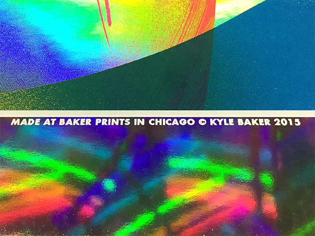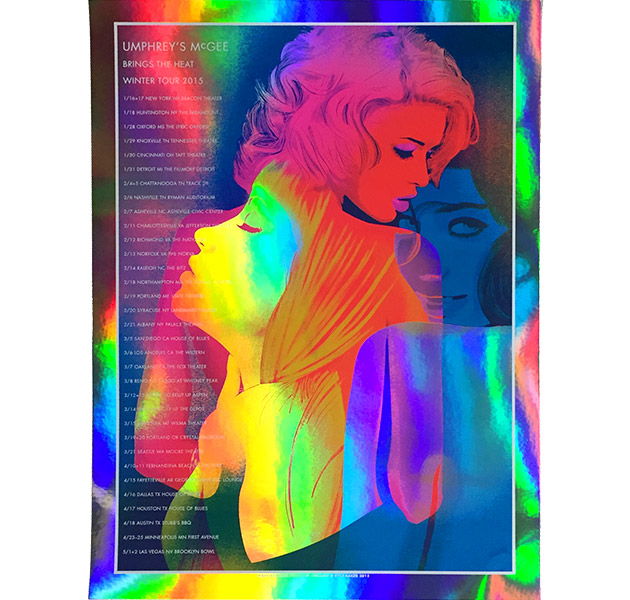
All images are actual photos. Working without a realistic digital mockup was scary! I decided to print proofs of a few different color-separation approaches—a very laborious and time-intensive process but ultimately worth the effort because my first couple trials were pretty much total whiffs.
Kate waited 5 minutes for me to shutup for 4 seconds.
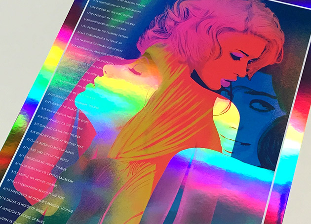
The original version of the poster was basically full-coverage ink—none of the foil would have showed through and even transparent acrylic ink blocks the reflective qualities, so I had to figure out a way to bring in the rainbow foil’s unique qualities while staying faithful to the original art.
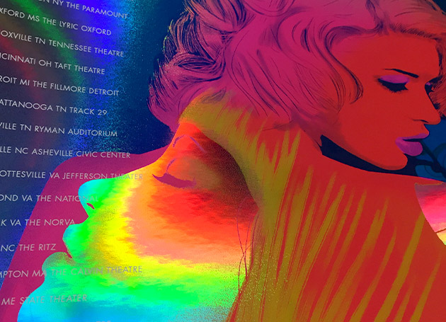
I ended up printing four screens instead of the original three—instead of knocking out the text with overlapping screens, I printed an opaque layer of white ink last. I also reduced the image size overall and added a border on the white screen, which I hope will make framing nicer with about an inch of the rainbow foil showing all the way around.
